


Global Mood

Sometimes a statistic, all by itself, tells an important story.
For example, researchers have estimated that roughly 60% of all mammals on earth are now livestock. If I wanted to persuade you that human beings dominate the planet, that's the kind of statistic I would cite. In fact, I'd rely heavily on this statistic, because it doesn't need to be precise in order to support my point. If the actual percentage were, say, 53%, the extent of our global impact would still be astounding.
In other cases, precision is more essential. Minor statistical errors may cause an entire story to unravel. This brings me to the topic of today's newsletter.
In an October 27 New York Times essay, David Brooks claimed that in recent decades people have become sadder, angrier, and otherwise more negative. By "people" he meant everyone, all over the world.
Ordinarily I don't quibble with essays like this, because I see their purpose as promoting thoughtfulness and empathy. Instead of asking whether the authors are right or wrong, I just listen to what they're saying about people.
In this case I will quibble. More than quibble, actually. Mr. Brooks based his argument on three recent big-data studies. None of these studies show what he thinks they show. Although I consider myself more liberal than Mr. Brooks, my concerns are statistical rather than political. This newsletter is a case study of what can go wrong when statistical findings are translated into plain English.
Headlines
First up is a study by New Zealand researchers David Rozado and colleagues, published this October 18 in the prominent journal PLOS ONE. Dr. Rozado and colleagues examined over 23 million headlines from 47 U.S. news outlets. The researchers found that from 2000 through 2019, headlines exhibited significantly increasing negativity (sadness, anger, fear, disgust). This overall pattern is shown in their figure below:

Brooks' view of this trend is that people are becoming more negative. Actually, Rozado and colleagues cautioned that we can't tell whether their findings reflect public mood, or "the sentiment and emotionality prevalent or pushed by those creating news content."
In other words, the fact that headlines are becoming more negative doesn't mean that readers are. In my opinion, what's happening is that news organizations have been sharpening their headlines as one of many strategies for retaining their dwindling audiences. Consider Pew Research Center's estimate of U.S. daily newspaper circulation (print and digital combined) since 1940:
As you can see, circulation begins to decline in the 1990s, then drops off more precipitously after 2000. The part of the graph from 2000 on looks a lot like Rozado et al.'s figure above.
I'm not strongly committed to the idea that more negative headlines are a response to declining readership. (The similarities in the two graphs merely hint at a correlation.) I'm just saying that data are data. Rozado's team described a change in headline content. That doesn't necessarily reflect a change in public mood. If you want to claim that it does, you have to make a case, but Mr. Brooks doesn't do that.
You may have been wondering: How could the researchers analyze 23 million headlines? They didn't do it themselves, obviously. Instead, they enlisted the help of an AI-driven natural language processing program.
One of the key limitations of this program is its accuracy. The researchers randomly selected 1,152 headlines, asked 71 people to rate them, then compared their ratings with the program's. The program turned out to be accurate 75% of the time. Not bad for a program, but here's the problem: Mathematically speaking, if you assume a 25% error rate for all 23 million headlines, there are scenarios in which headlines have actually not become more negative over time.
I don't think scenarios like this are especially plausible, because they require that over time, errors increasingly consist of positive headlines being classified as negative rather than vice versa. My point is simply that we should treat the findings cautiously. We don't know how many mistakes the program made or what kinds of mistakes those were. Even the human raters disagreed sometimes – inter-coder agreement for the 1,152 headline sample was only 80%, presumably because not all headlines fit neatly into a simplistic distinction between positive and negative.
This study illustrates the power of big data. Only by looking at millions of headlines could you even begin to make a broad statement about changes in their emotional content over time. But this may not reveal anything about public mood.
From a journalistic perspective, what went wrong is that Brooks drew conclusions that aren't supported by the data, while failing to acknowledge any methodologically-based uncertainties.
Pop music
Mr. Brooks also cited a 2019 Evolutionary Human Sciences article in support of his thesis. A research team co-led by Dr. Charlotte Brand at University of Exeter and Dr. Alberto Acerbi, now at Brunel University London, along with Dr. Alex Mesoudi, analyzed the lyrics of more than 150,000 songs recorded between 1965 and 2015. The researchers found an increase over time in the use of words that convey negative emotions (sadness, anger, etc.) along with a decrease in the use of words that convey positive ones.
Brooks took these findings to mean that people are growing more negative. But Brand and Acerbi did not make this claim in their article, or in a separate, informal summary of it. They didn't even include it among the many possible interpretations of their data they considered.
The researchers analyzed two databases: Lyrics from 4,913 songs that made the annual Billboard Hot 100 list, and lyrics from 159,015 songs in musixmatch.com. (By definition, Billboard songs are more popular than the other group, because they represent the songs with the most sales, radio play, and online streaming.) Here are three additional findings:
—Billboard songs tend to have more positive lyrics than musixmatch.com songs.
—Within the Billboard dataset, more popular songs tend to have more negative lyrics.
—The extent of positivity (or negativity) in song lyrics, in a given year, is related to the average number of positive (or negative) lyrics in songs that were recorded in the preceding three years.
Although all effects were small, the third one above was most consistently observed. Brand and colleagues took it to mean that songwriters have some tendency to draw upon, or be unconsciously influenced by, the lyrics of recently-recorded music. This makes sense from a creative perspective (artists tend to be influenced by their contemporaries) as well as a business one (the most popular art generates demand for similar output).
Although Brooks indicated that song lyrics are becoming more negative overall, you can see now that this doesn't do justice to what Brand and colleagues found. They point out that the greater positivity of Billboard vs. musixmatch.com songs is consistent with a separate big-data study, which also showed that more popular songs tend to be more emotionally positive than less popular ones.
In sum, Brand and colleagues found changes in the content of song lyrics over time, attributable to many sources but mainly to the influence of recent music on the lyrics of newer music as it's written.
From a journalistic perspective, what went wrong here?
1. Misrepresented data.
Mr. Brooks did not accurately characterize the data, the researchers' interpretations of the data, or even the speculative interpretations they entertained. The study provides no evidence that public mood is growing more negative.
2. Unsubstantiated premises.
Brooks assumed that when people become more sad, artists write more sad songs. (Or, regardless of what kinds of songs are written, sadder ones become more popular). Brooks provides no evidence for this assumption. Brand and colleagues, and others, provide evidence against it, because their data suggest that popular songs tend to have more positive lyrics than less popular songs do.
Happiness
Trends in the content of headlines and lyrics tell us something important about cultural change, but they don't necessarily reveal anything about public mood. If you want to know whether people are becoming sadder, you need to ask them directly. This brings me to the third big-data study that Brooks discussed, one which does focus on mood.
On September 15 of this year, Gallup, Inc. released new data from a survey of subjective well-being that it has distributed globally since 2006. The approach to sampling varies somewhat from year to year, but generally, at least 1,000 people are surveyed from each of over 100 countries. The gist of the 2022 findings is that, internationally, "unhappiness is now at a record high".
Gallup's methods and findings make much more sense in light of its activities as a highly successful for-profit company. Before getting to the data I want to spell out what I mean by that.
Gallup makes its money through business analytics and consulting. However, most of us hear about the company because it spends millions of dollars on polls and surveys that are frequently covered in the news.
In a recent newsletter on "quiet quitting", I discussed how Gallup uses its polls and surveys to drum up business. Gallup claims to show that quiet quitting is on the rise, but the methodology is flawed, the data summaries are deceptive, and the survey used to measure employee engagement is pitched to managers as a tool for improving productivity – and part of an inclusive package that can be purchased to achieve this goal. In short, the ultimate purpose of Gallup's polls and surveys isn't to illustrate social trends, but to sell products and services. (Viewed this way, we see one more troubling example of a company profiting, albeit indirectly, from data that people freely provide.)
No surprise then that Gallup's 2022 survey was accompanied by marketing-focused verbiage, along with a new book from its CEO, which warns political and business leaders that focusing on quality of life indicators such as GDP has caused them to overlook the fact that people are less happy than they used to be. Gallup Press publishes the book, and the company offers products and services designed to address the problem.
Now for a look at some of Gallup's new survey data. One trend, already getting media attention, is that across the world, negative emotional experiences increased from 2006 through 2021. How did Gallup determine that? Each year, they asked people, in their native language, whether, on the previous day, they experienced "a lot of" the following emotions: physical pain, worry, sadness, stress, and anger. Peoples' responses were then collapsed, converted to a 100 point scale (the higher the number, the more negative emotions experienced by the person), averaged for each country, and finally averaged across countries. Here's the main finding, cut and pasted from Gallup's report:

No question there's an upward trend, but the graph is deceptive owing to the limited range of values on the y-axis. A 100-point scale was used, and the actual values for 2022 ranged from 14 (Kazakhstan) to 59 (Afghanistan). I took the liberty of redrawing the graph using a more appropriate range for the y-axis. The new graph is shown below.
Same data, but the line looks much flatter now. Still, the numbers do increase over time. Are the world's people really feeling worse than we used to?
I don't think we can conclude anything from these data. Here are three points that put the statistics in context:
1. There's a lot of room for error.
(a) The survey doesn't ask about the intensity of people's negative emotional experiences. A person gets a higher score if they experienced stress and anger as opposed to only stress, but some people might say that feeling extremely stressed all day is worse than feeling low levels of stress and anger all day.
(b) The survey asks about peoples' experiences on the previous day. Responses are averaged for each country before calculating an overall average. For certain countries, in certain years, the day before the survey is administered might've been unusual (e.g., unusually bad), in which case that country's mean score might've been misleading (e.g., misleadingly low) and affected the overall mean.
2. Based on the limited data Gallup provides, we can't tell whether the global trend primarily emerges from country-specific effects. For instance, we can't rule out the possibility that for most countries, there were no consistent trends from 2006 though 2021, but negative trends in a few countries created what looks like overall global change.
3. Experimenter bias is more of a risk in this kind of study than in most. Gallup's polls and surveys are a business expense that support the company's revenue-generating products and services. Given that many of those products and services help organizations address problems with enthusiasm, engagement, and so on, Gallup presumably hopes that their well-being survey will reveal substantial, if not increasing negativity (and thus a need for what they sell). Those who administer the survey probably know this. The prospect of experimenter bias arises because the survey is administered either by phone or face-to-face.
I'm not accusing anyone at Gallup of experimenter bias, intentional or otherwise. I'm just noting that the potential for this kind of bias is much greater here than in studies where there aren't financial incentives for particular outcomes, and those who conduct the research don't gather data directly from participants (e.g., because the surveys are completed online).
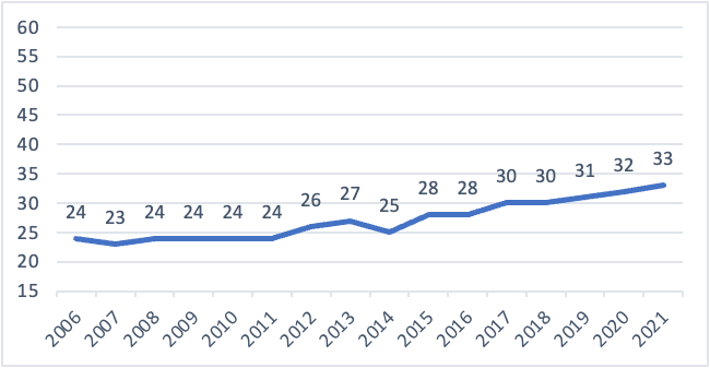
Finally, Brooks focused heavily on people's responses to another one of Gallup's questions:
Please imagine a ladder with steps numbered from zero at the bottom to 10 at the top. The top of the ladder represents the best possible life for you and the bottom of the ladder represents the worst possible life for you. On which step of the ladder would you say you personally feel you stand at this time?
Here is Gallup's graph of the findings (with a more appropriately-scaled y-axis this time):
This graph shows the means (on a 10-point scale) for the 20% of people with the highest ratings and the 20% of people with the lowest ratings. In other words, you're looking at data for the people who responded most positively or most negatively to the question. For the positive group, their mean increases by 0.6 points over time (from 8.3 to 8.9). For the negative group, their mean declines by 1.3 points (from 2.5 to 1.2).
In this graph, one statistic stands out from the rest: That mean of 1.2 for the negative group after 2018-2020. Such a mean is impossible unless the majority of the group chose the lowest possible rating (i.e., a rating of 1).
I would say that this statistic, which Brooks didn't pick up on, is the one that most strongly supports his argument, only it's unclear what Gallup is measuring. The question is about your best and worst "possible" life, "at this time". Is this a question about what's possible in theory for a human being, or what's realistically possible for you? Does "at this time" refer to today, this week, or this year? I could be happy with my life but still choose a low number if I'm assuming, for example, that being 10 years younger and a million dollars richer would be better. Or, I could be unhappy with my life but choose a high number, because I think that I'm already living the best life I can, realistically speaking. Alternatively, I could be quite happy in general but respond with a low number, because, this week, my dog got sick, my car broke down, and I caught a cold. These interpretive issues make it difficult to evaluate the statistically small changes that Gallup observed.
In terms of journalistic practice, what went wrong here?
1. Brooks overstated the findings. He failed to acknowledge small effects, possible errors, alternative interpretations, and Gallup's financial incentives.
2. Brooks is never clear about what the Gallup survey (and the other studies) are supposed to be measuring. His essay, entitled "The rising tide of global sadness", refers to increasing sadness, anger, and "negativity" in the culture. He mentions increasing "harshness". In discussing Gallup, he shifts to declines in "well-being", "happiness", and "emotional health", along with increases in "unhappiness", and "misery". This is a swamp of related but somewhat distinct constructs.
Conclusion
Is there a rising tide of sadness, anger, etc.? Are people less happy than they used to be?
I think we need to be courageous and say: We don't know.
We what do know is that headlines and song lyrics have become slightly more negative in recent decades. This is interesting news about the culture. But none of the researchers claim to tell us anything about public mood. The Gallup survey addresses mood, but the effects are small, and the findings have low credibility given the financial interests of the researchers, the potential for experimenter bias, and the many sources of error.
A country cannot feel more or less unhappy, but an individual can. And, our emotional lives are rarely so simple. Just before the pandemic hit, I decided to retire. My feelings since then have included happiness and renewed excitement about the future, mingled with sadness about the pandemic, anger about its politicization, frustration with its management, and fear for the safety of loved ones – all lightly glazed with the sort of numbness that comes from staying at home too much. At the same time, I've been helping raise a new granddaughter, which has been a honking scramble of joy, fatigue, inspiration, worry, and pride. How do you capture all that on a survey? How do you combine my "data" with someone else's and make generalizations? Maybe any efforts to measure global happiness or unhappiness are doomed from the start.
This brings me back to the statistic that I opened with – the estimate that roughly 60% of all mammals on earth are livestock. I can't judge this estimate myself, because it's derived from highly technical biomass-related theory and data. I can only say that if it's off by, say, 10%, I'd still be astonished by how many of the world's mammals are being raised for food. None of the studies I discussed in this newsletter could afford anything close to that level of imprecision. A few percentage points of error, and the longitudinal trends would disappear.
With that caveat in mind, we can thank big data for suggesting that headlines and song lyrics are becoming more negative. It's worth examining what's causing these changes (and potentially related ones such as increasingly hostile political rhetoric). Meanwhile, it's not helpful for a prominent journalist to step back and glibly opine that people are getting unhappier. Better to step back further and simply say: there's a lot of unhappiness in the world – and happiness too, and much more. These things aren't easily quantified, and how you engage with them is not a matter of statistics either.
Thanks for reading!